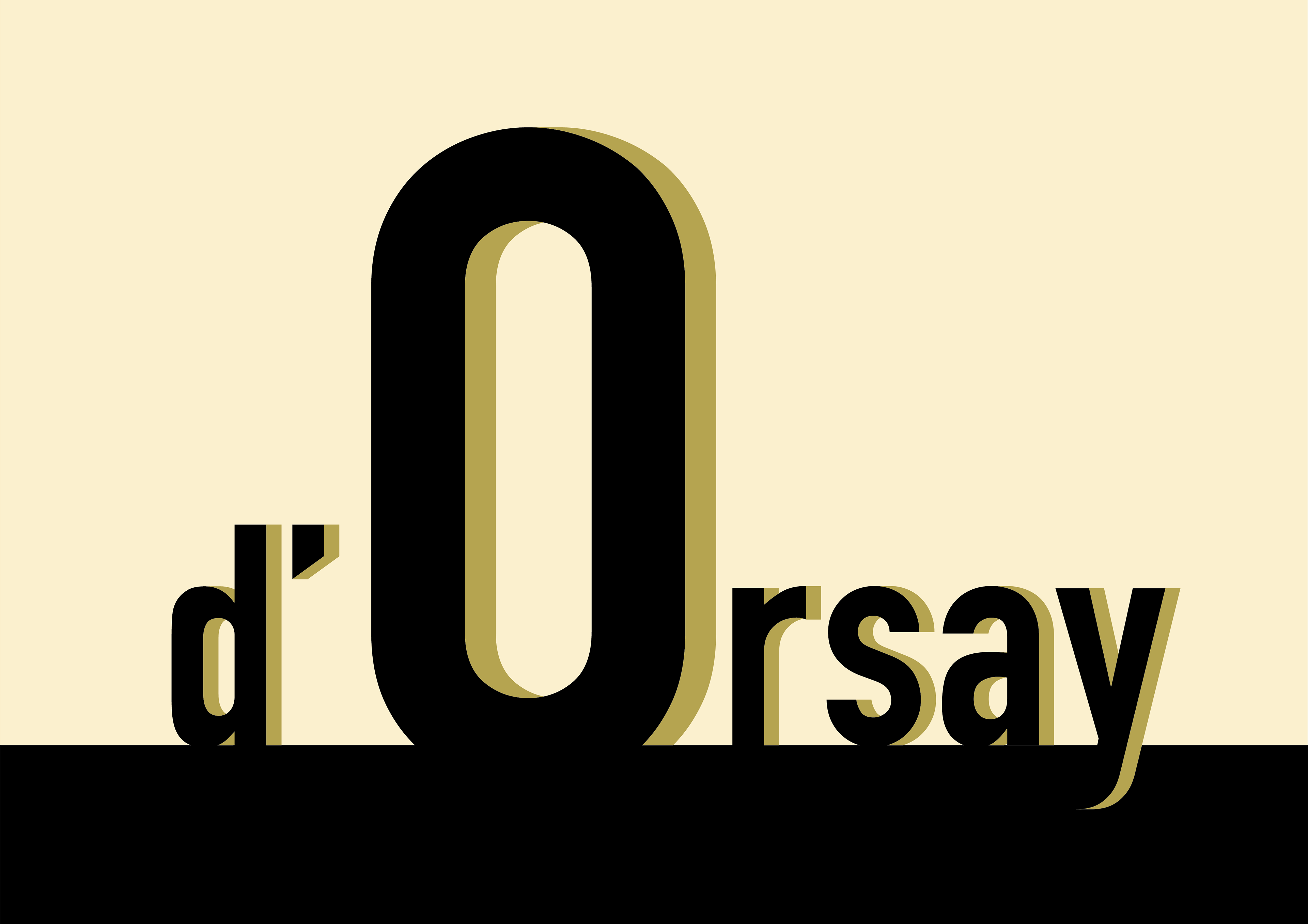
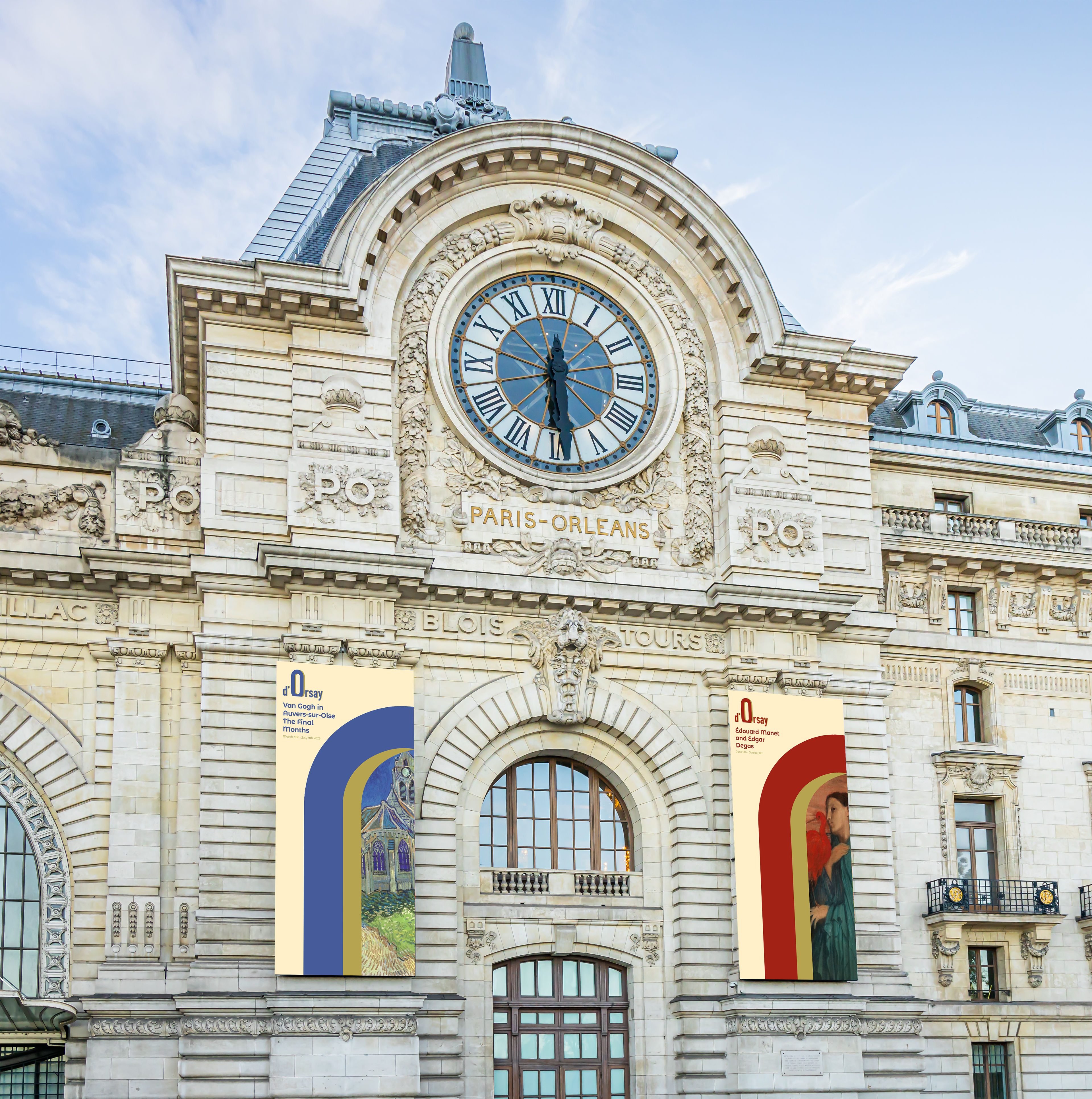
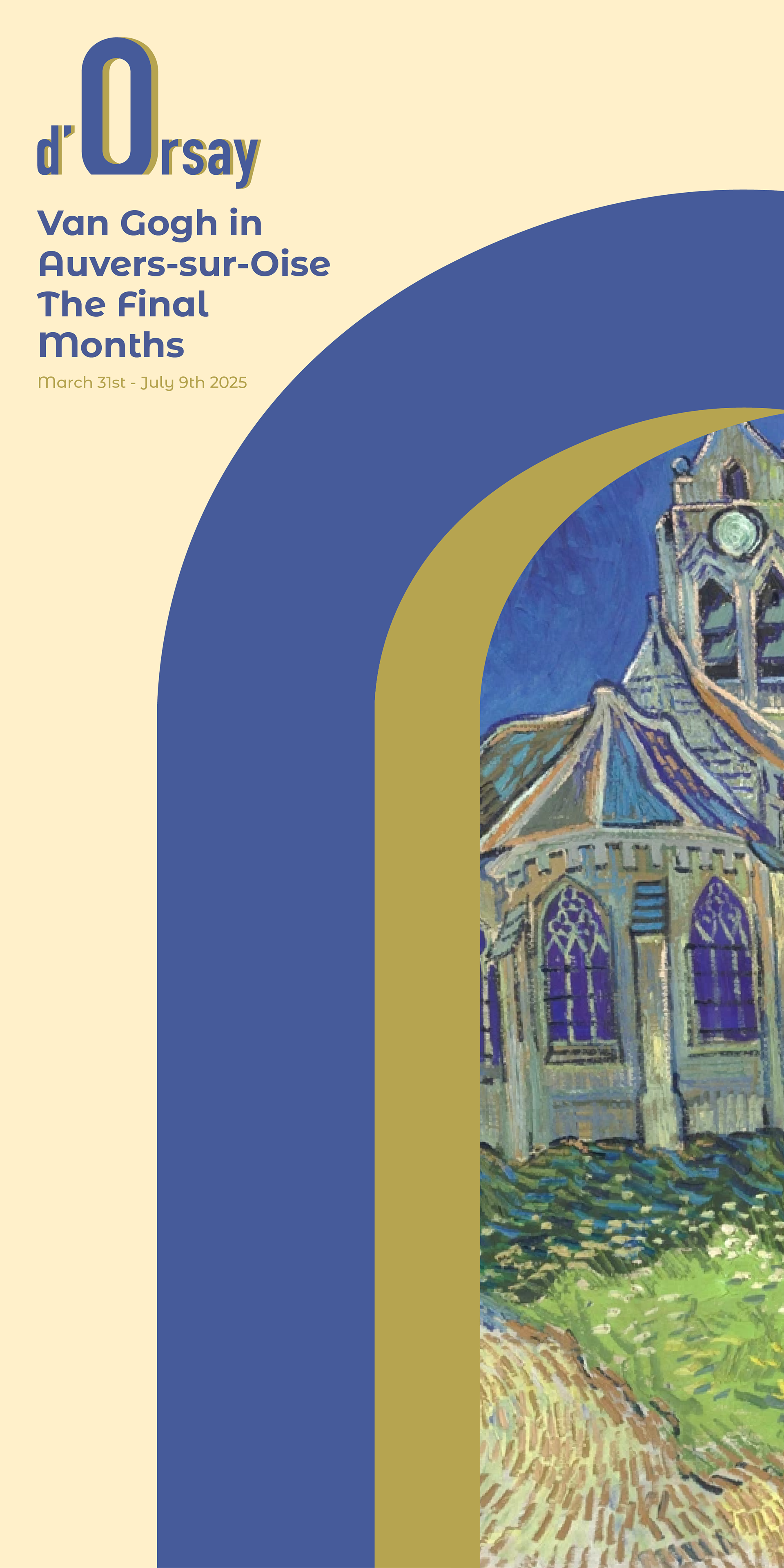
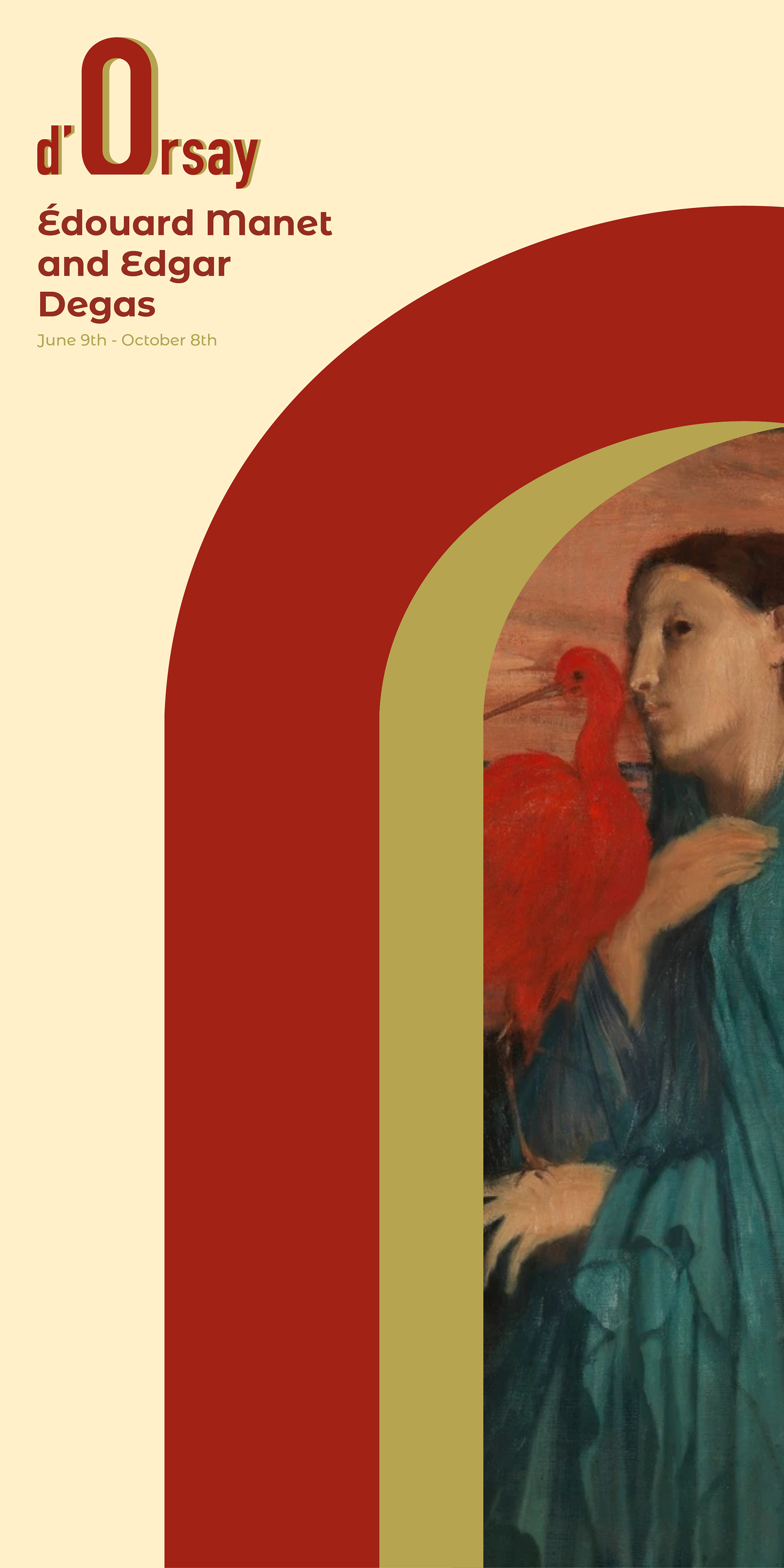
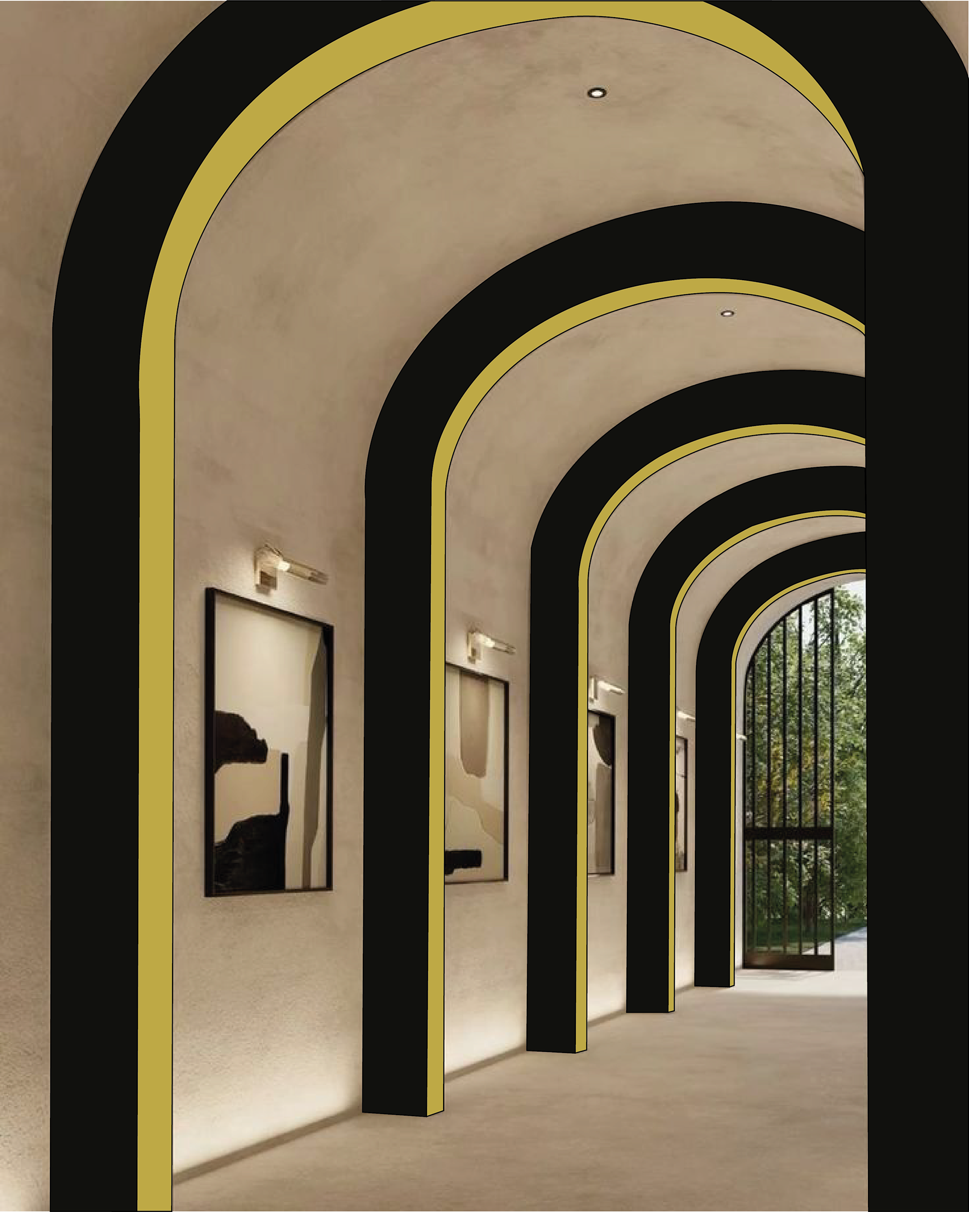
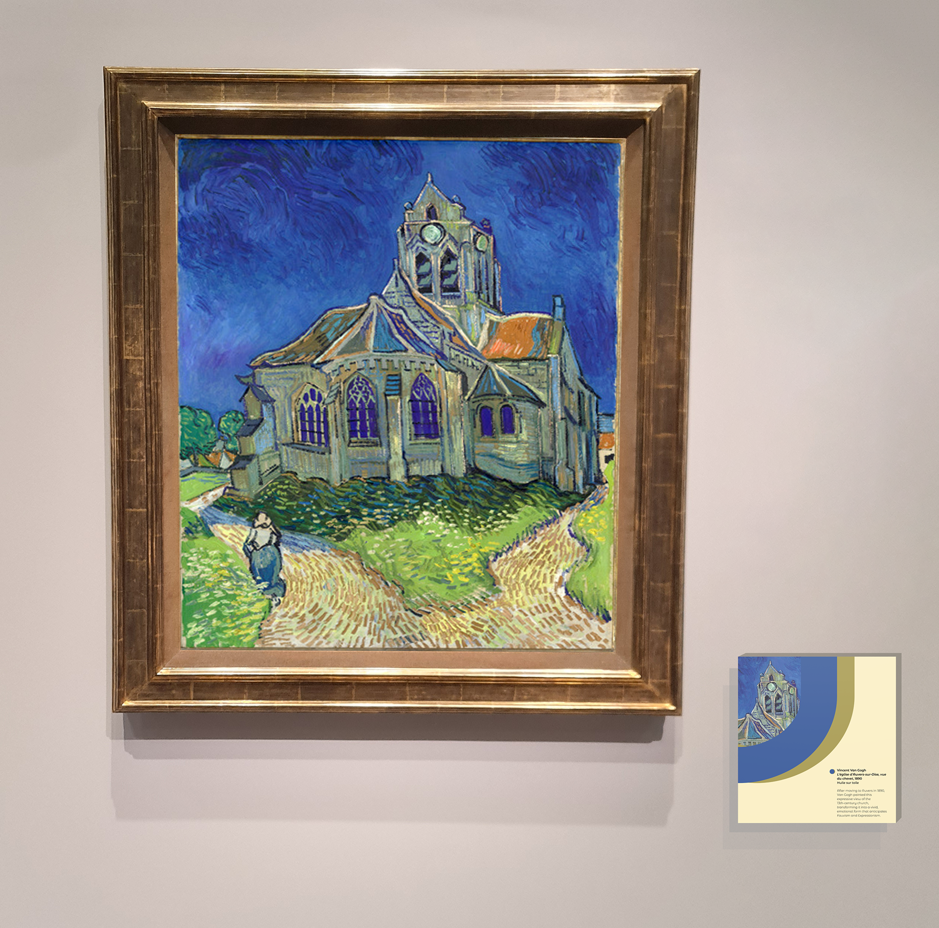
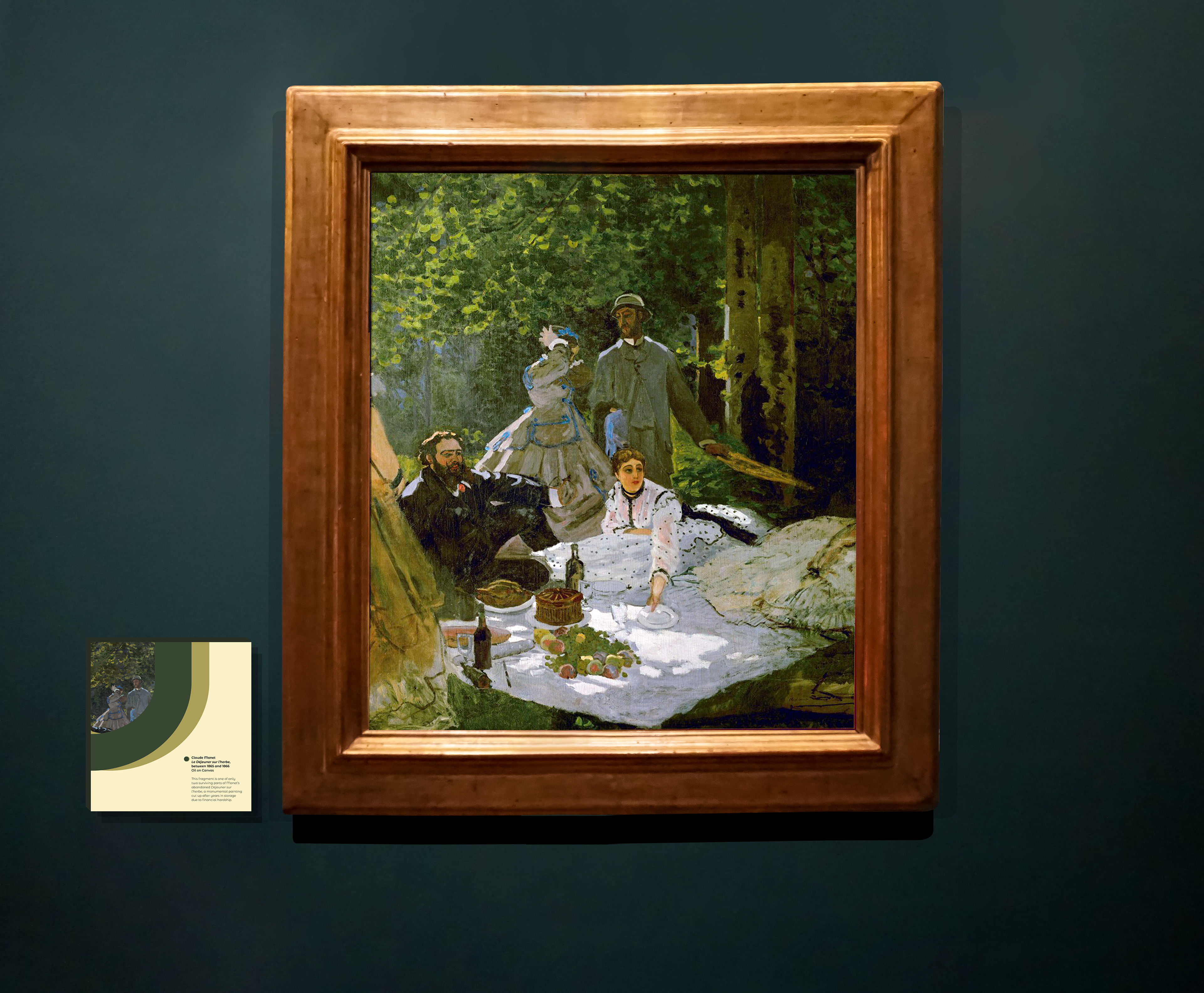
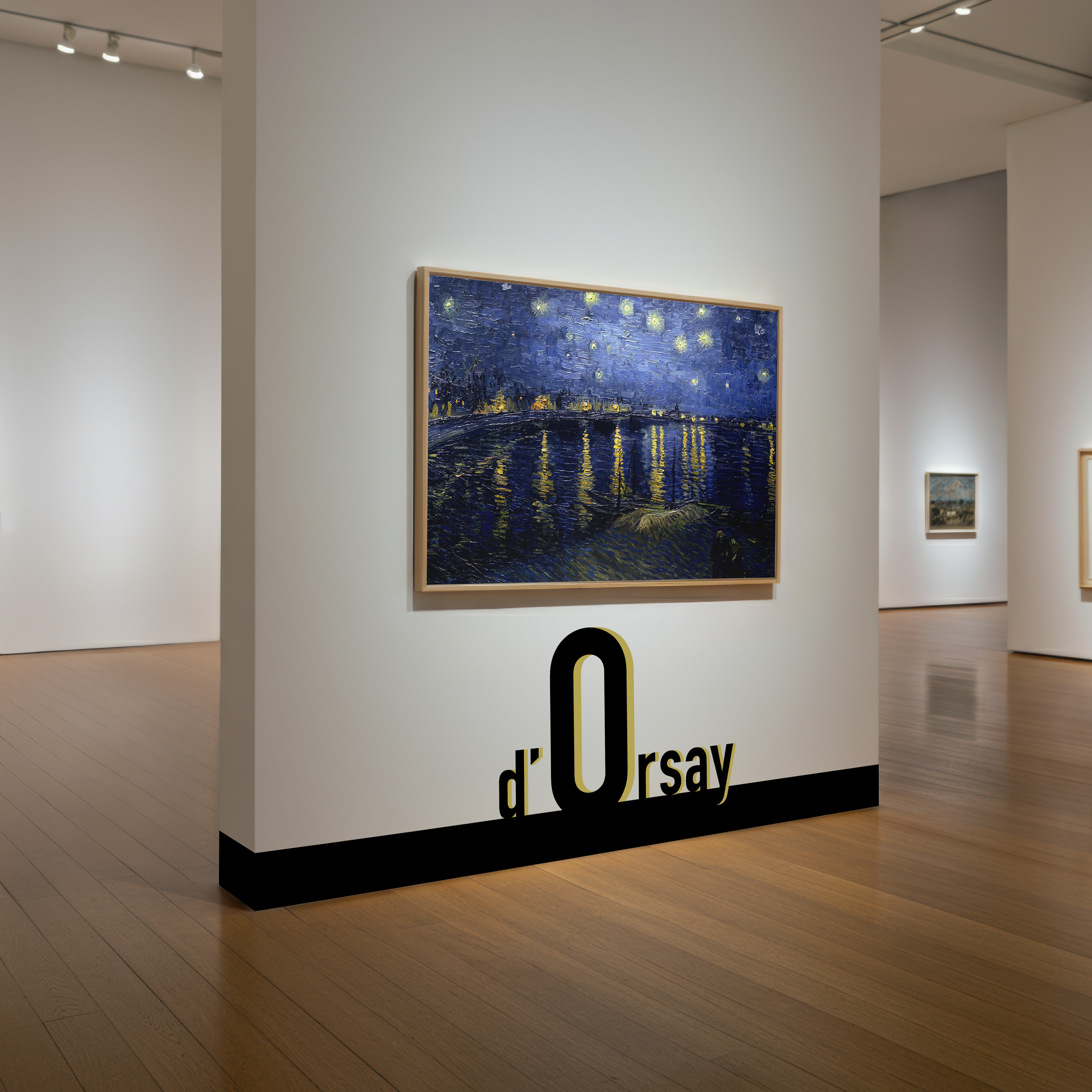

A rebrand of the Musée d’Orsay in Paris, formerly a train station, drawing inspiration from the museum’s grand architecture. The museum’s stunning main hall, featuring a larged curved celling, and the arched windows that run along the sides of the building, serve as the idea behind the smooth rounded typeface selected for the wordmark, and the custom O, which is used as the primary brand asset and as a ‘window’ into the art displayed at the Musée d’Orsay. The word ‘Musée’ has been dropped in the wordmark to place the spotlight on d’Orsay, making for short, catchy and memorable name, a change made possible by the museums’ international recognition. This is a university project completed in my final year.